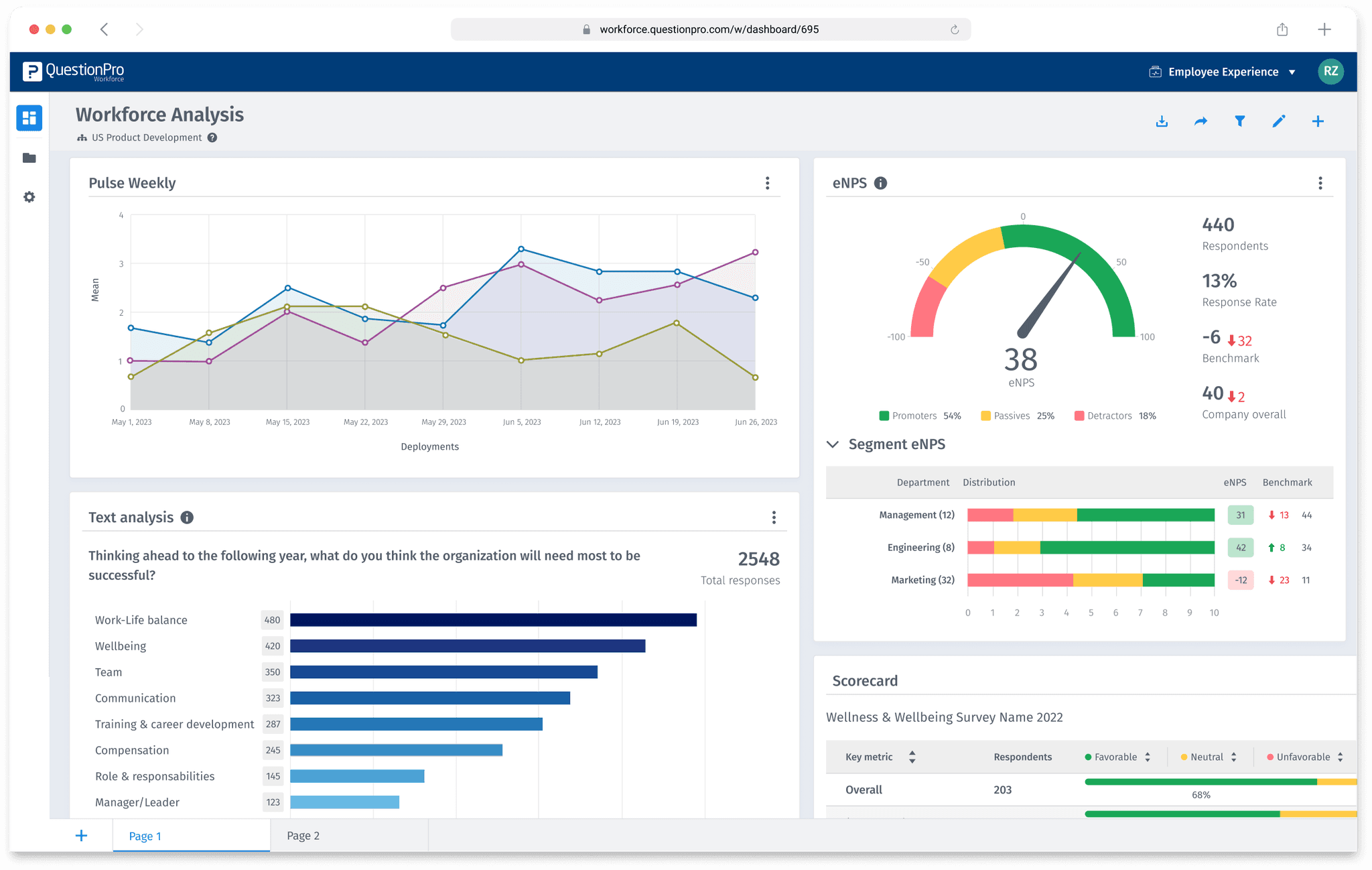
In 2023, we set out to redesign the Workforce analytics portal, a vital tool for HR managers to monitor and identify trends using employee survey data. The goal was to provide managers with a fresh user experience, with streamlined navigation, expanded functionalities, customizable dashboards, and new, insightful, easy-to-use widgets.
THE PROBLEM
📈 Data storytelling
🔍 Fragmented analytics
📐 Designing for scale
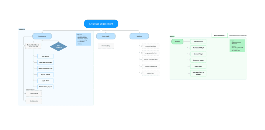
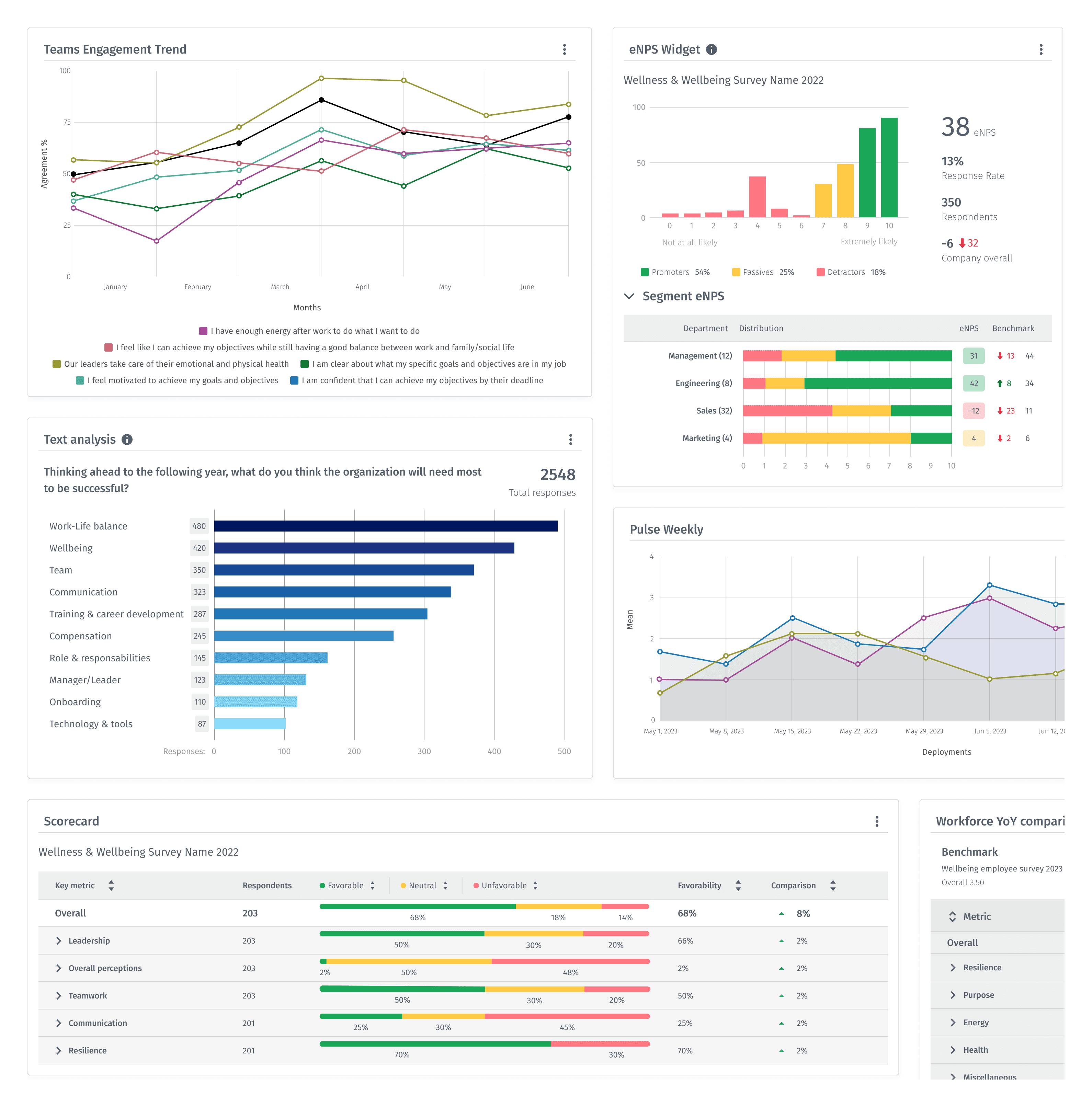
For the introduction of a new set of customizable widgets, we had to create a scalable flow and structure that would fit all the different functionalities and visuals.
THE PROCESS
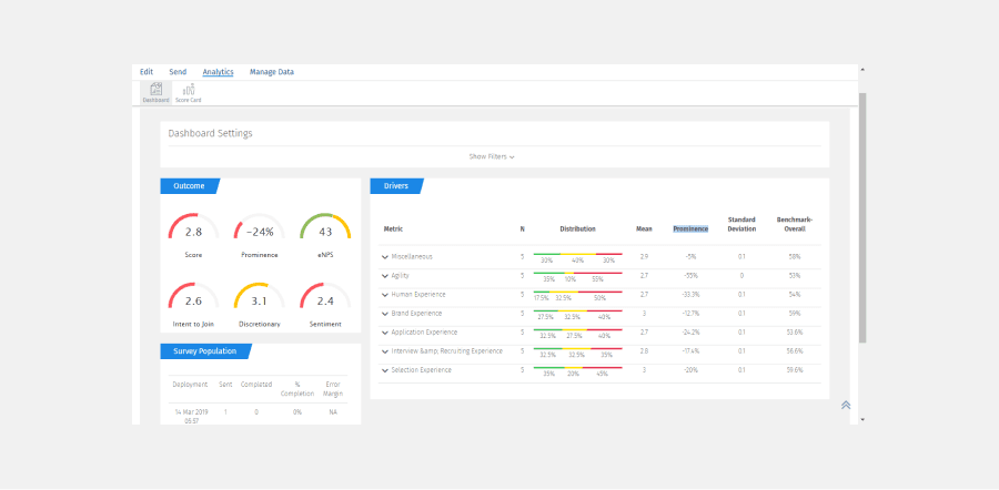
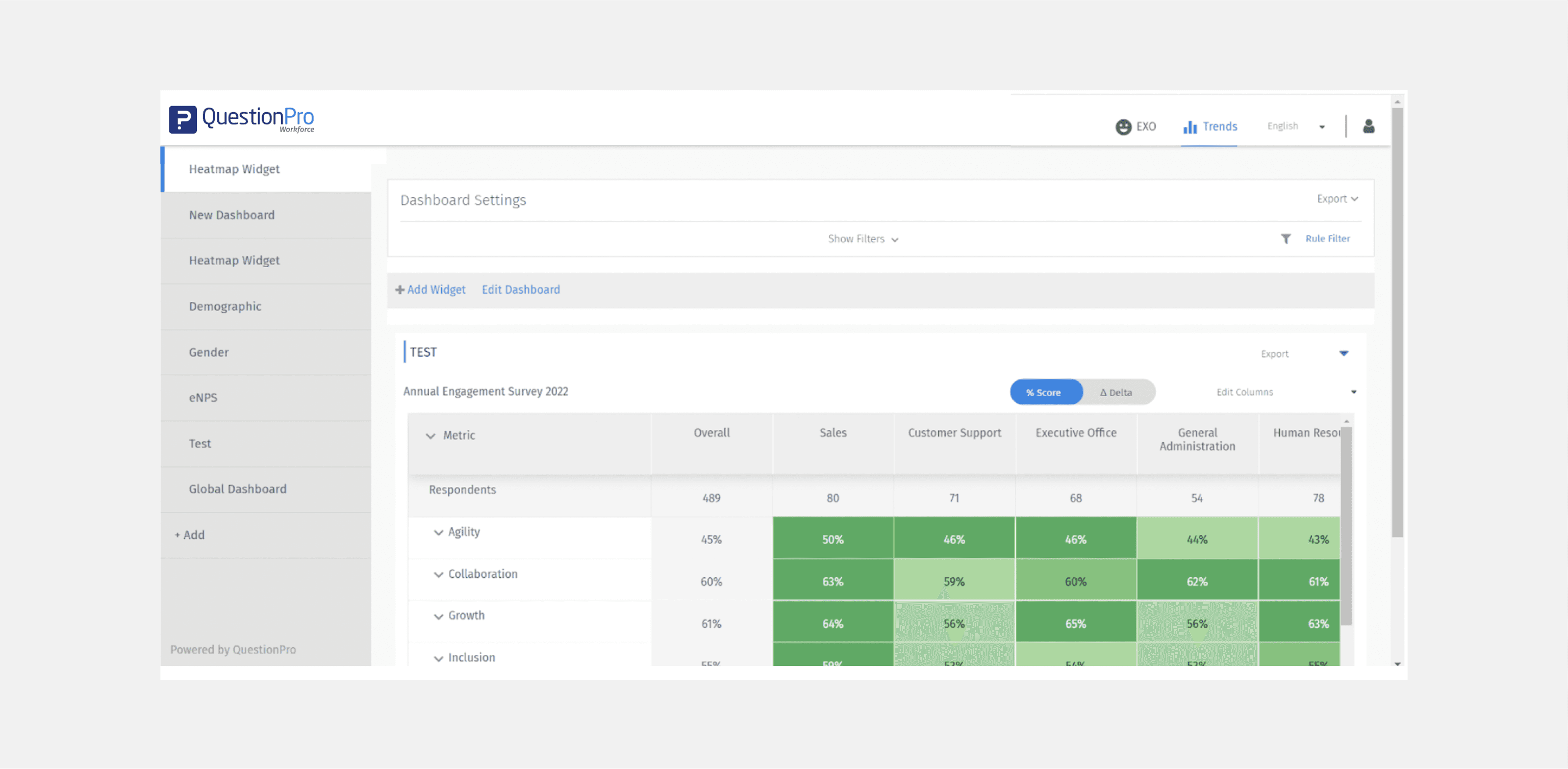
On our previous admin analytics dashboard, widgets had dated UI that lacked hierarchy, overwhelming product complexity and a lack of proper styles.
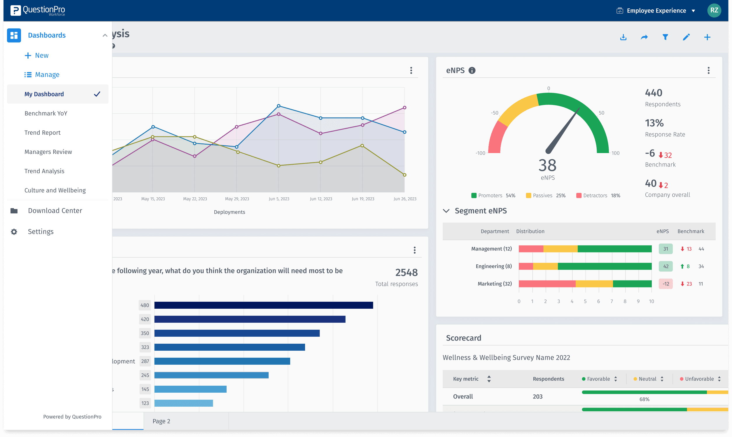
On the portal side, the navigation was static and bulky, with numerous actions occupying most of the screen space and drawing the user's attention away from the actual data, which was relegated to a secondary position.
We defined the scope and architecture, considering the new functionalities and centralizing all the analytic widgets in one place.
THE USERS
HR Administrator
Needs a powerful dashboard with options to customize and filter the data that they need. They’re here for the powerful analytics and dig deep to the insights. This is part of her main role.
Manager
Managers reviews and interprets the data, but doesn’t have a lot of time to analyze it, they need an easy to use platform that they can check out quickly and understand the needs of his employees.
THE RESULTS
Improved navigation
We simplified and reorganized the interface for better usability and a delightful experience for Portal users.
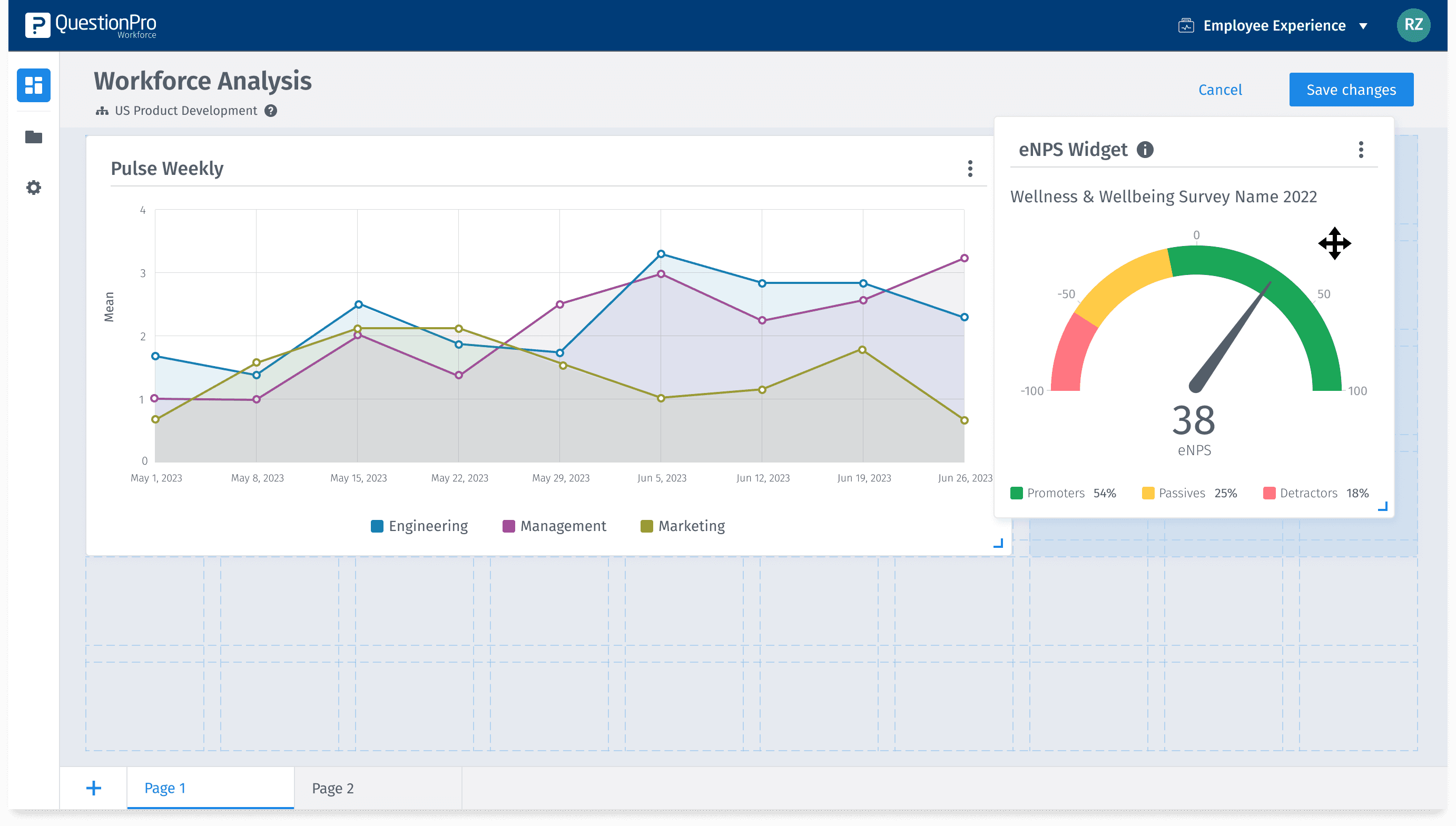
Enhanced settings
We reorganized the options the user has to edit and customize the dashboards to its needs.
Delight
The visual design of the Portal was improved and cleaned-up, allowing the data to be the main focus.
